
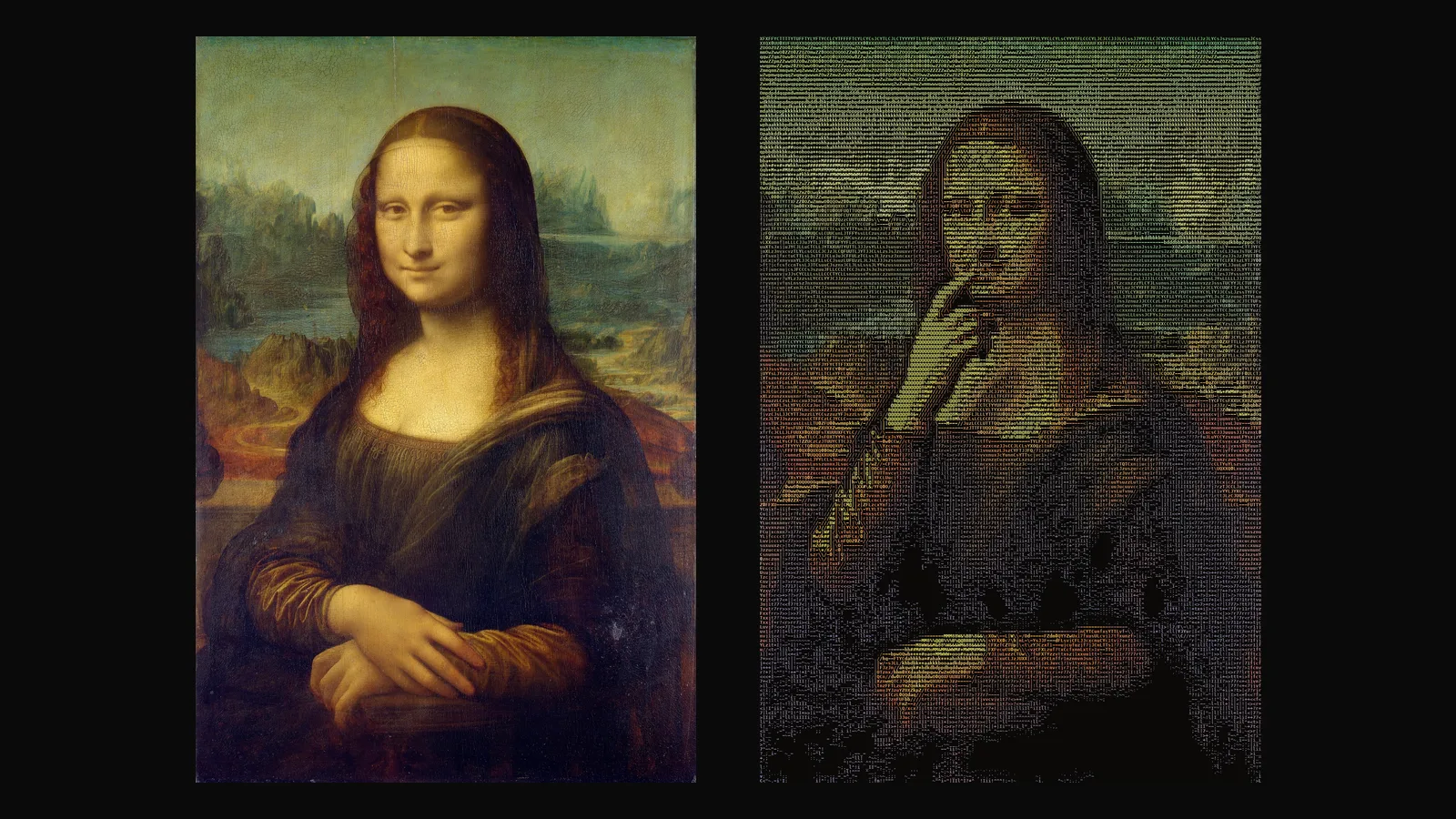
An ASCII picture is an image built from text characters: letters, digits and punctuation arranged so that, from a distance, their density and color form shapes. Up close it is text; from a step back it is a face, a landscape or a logo. This article looks at where the idea comes from, why it keeps returning in digital culture and on screen, and why turning a moving image into ASCII without flicker is a real technical problem.
What does ASCII mean?
ASCII, the American Standard Code for Information Interchange, is a character encoding standard from the 1960s. It assigns numbers to 128 characters: the Latin letters, digits, punctuation and control codes. Because almost every computer and terminal could display these characters, "ASCII art" became the common name for pictures made of them, even though many works use wider character sets today.
Pictures made of characters before and after the computer
Making images with typed characters is older than the personal computer. Typists composed pictures on typewriters, and early computer users printed images built from characters on line printers and teleprinters, because those machines could print text but not graphics. Later, when people met in text-only spaces such as bulletin board systems, newsgroups, email and chat, characters were the only way to draw: signatures, banners, small diagrams and the sideways faces that became emoticons all grew out of this limit.
The limit became a style. Text art is still used in terminal programs, in code comments and README files, in game and demo culture, and in graphic design that wants to look technical, handmade or nostalgic. Open-source software has long been able to show images and even video as text inside a terminal, and many people first see ASCII video that way.
Why does it work on screen?
Film and video often need a quick visual sign for "this is happening inside a computer" or "this is the machine's point of view". Columns of characters, glowing monospaced text and pictures that resolve out of symbols are an established way to say it in title sequences, music videos and interfaces. ASCII imagery also has a practical side: it is legible at small sizes, it survives heavy color changes, and as real text it can be selected, copied and searched.
How does an image become ASCII?
The basic conversion has four steps:
- Grid. The image is divided into cells, one character per cell. The number of columns sets the detail: more columns, smaller cells, finer features.
- Brightness to character. Each character covers a different share of its cell with ink. Sorted by that share, from a space to dense signs such as
@or#, they form a ramp. A cell gets the character whose density matches its brightness. - Edges. Where the image has a clear edge, characters with a direction, such as
/,\,|and-, follow the contour better than density alone. - Color. Each character can carry the average color of its cell, or one fixed color for a terminal look.
Monospaced fonts matter because every character takes the same width, so the grid stays straight. Cells are taller than they are wide, so the image is sampled with that ratio in mind, otherwise faces look stretched.
Why is ASCII video so much harder?
The obvious way to make an ASCII video is to convert each frame on its own. The result usually shimmers: characters jump back and forth even where nothing moves. The reason is the threshold. A cell whose brightness sits near the border between two characters flips between them with every tiny change, and video is full of tiny changes: sensor noise, film grain, compression artefacts, slight shifts of light. In a normal video those changes are invisible. In ASCII each one swaps a whole symbol, and the eye notices.
Camera movement makes it worse. When the camera pans or zooms, almost every cell changes in every frame, and the picture turns into a stream of characters with no stable shape. Color adds a second layer of flicker: a cell can keep its character but switch between two nearby colors.
We measured this on our test clip, a 5 second animation of the Mona Lisa at 180 columns and 121 frames. Converted frame by frame, 9.78% of all characters changed from one frame to the next. That sounds small, but it means thousands of symbols jumping every second, most of them in areas where nothing moves.
What keeps a moving ASCII picture steady?
There is no single trick; stability comes from several small decisions that work together. These are the ones we use in Glyphmation:
- A still camera. The video is made with the camera locked, so only the moving parts of the scene change. This decision alone removes most of the problem.
- Empty flat areas. Flat, low-detail areas, such as a plain background, become empty space instead of a carpet of faint characters that tremble with every bit of noise.
- Looking across time. A cell's character is decided by looking at several frames around it, not just one, so a single noisy frame cannot flip it.
- Hysteresis for characters and colors. A cell keeps its current character or color until a new one is clearly and consistently better, instead of switching the moment it becomes slightly better.
- A seamless loop. When the motion returns to the first frame, the last frames are blended into the first ones, so the loop has no visible jump.
Together these steps brought the change rate of our test clip from 9.78% to 2.60% of characters per frame, and almost all of the remaining changes are where something really moves. Stability also made the files smaller: the HTML version of the clip went from 1,694 KB to 554 KB, because there is less change to describe.
How much detail is enough?
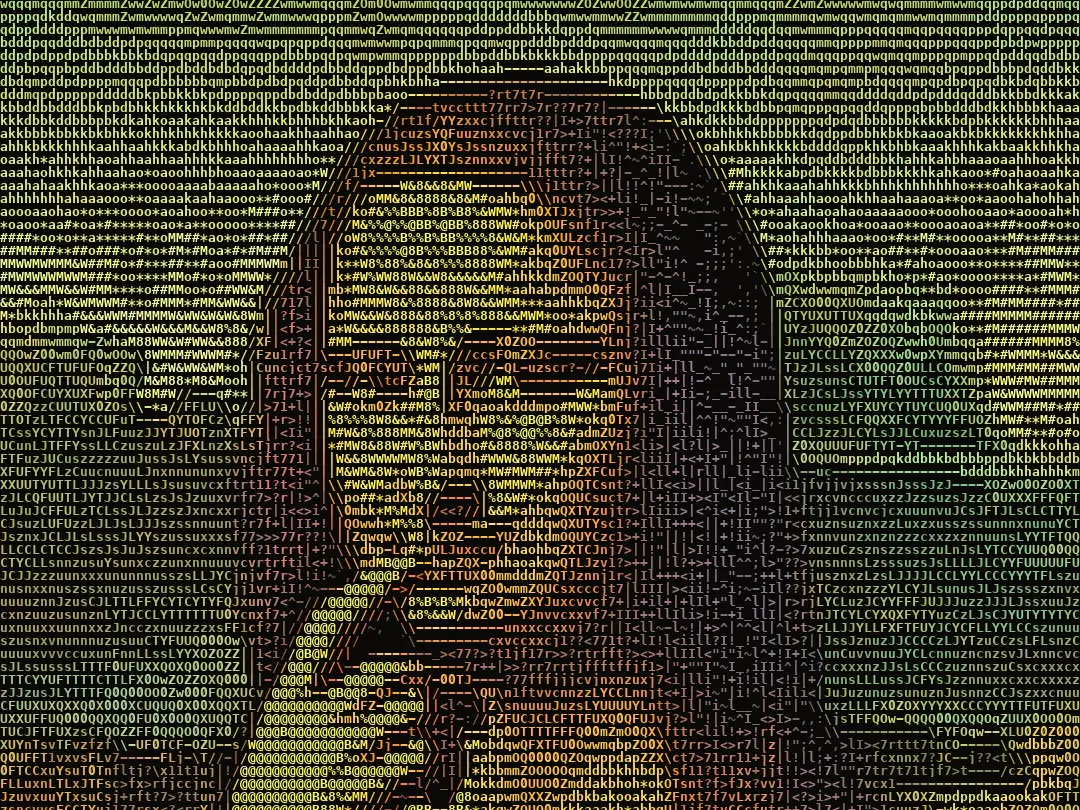
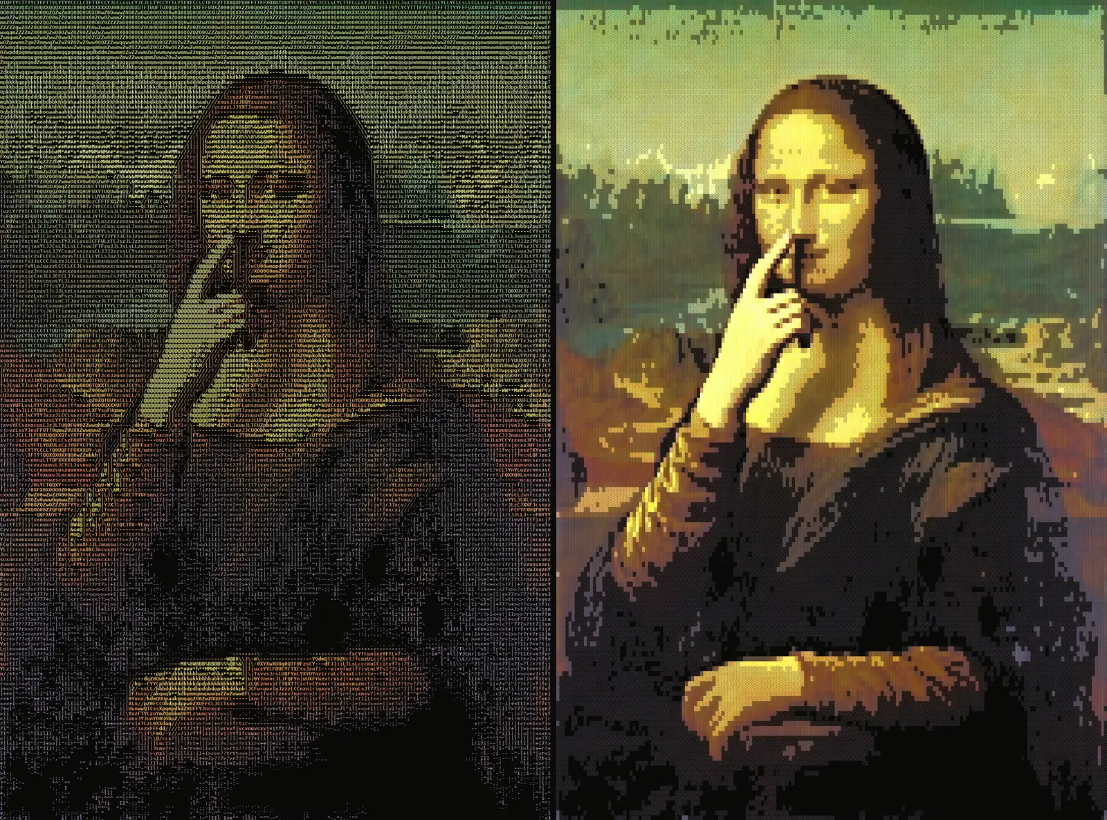
Columns are a trade-off between readability and texture. In our tests a face at 120 columns was often too coarse to recognise, while 180 columns kept the eyes, the nose and even the fingers readable. 240 columns add more detail, at the cost of larger files. For bold shapes, logos and posters, fewer columns can look stronger, because each character becomes a visible part of the design.
The character set changes readability too. Glyphmation has three: Standard, Blocks and Letters only. In our tests block characters gave the most readable result: the dense cells carry colors and shapes with a clarity close to pixel art. Letters only gives a softer, text-like texture, but on dark images the face can stay less clear.
MP4, GIF or HTML?
- MP4 is the easiest to share and upload. Text is hard for video codecs, so a steady picture also helps the MP4 stay sharp at a reasonable size.
- GIF plays almost anywhere without a player, but the files are larger and the palette is limited.
- HTML keeps the characters as real text. It plays in a browser, stays sharp at any zoom, and the text can be selected and copied.
Limits
ASCII is a reduction. Small details, thin lines and low-contrast areas can vanish into the grid, and fast or complex motion still produces more change than a slow gesture. Good results come from images with a clear subject, from simple, readable motion and from a column count that matches the subject. In Glyphmation the browser preview shows the effect of these choices for free before anything is rendered.
Frequently asked
Is ASCII art only the 128 ASCII characters? Not anymore. The name stayed, but many works use larger character sets, block characters or colored text. Glyphmation offers three sets: Standard (printable characters plus a few directional signs for edges), Blocks (block characters) and Letters only.
Why not just convert every frame separately? Because tiny changes in brightness flip characters near their thresholds, and the picture shimmers. Stable ASCII video needs decisions that look across several frames.
Does a still camera make the film boring? The motion moves to the subject instead: a gesture, a turn of the head, hair or cloth. Against a steady grid of characters, that motion stands out more, not less.