
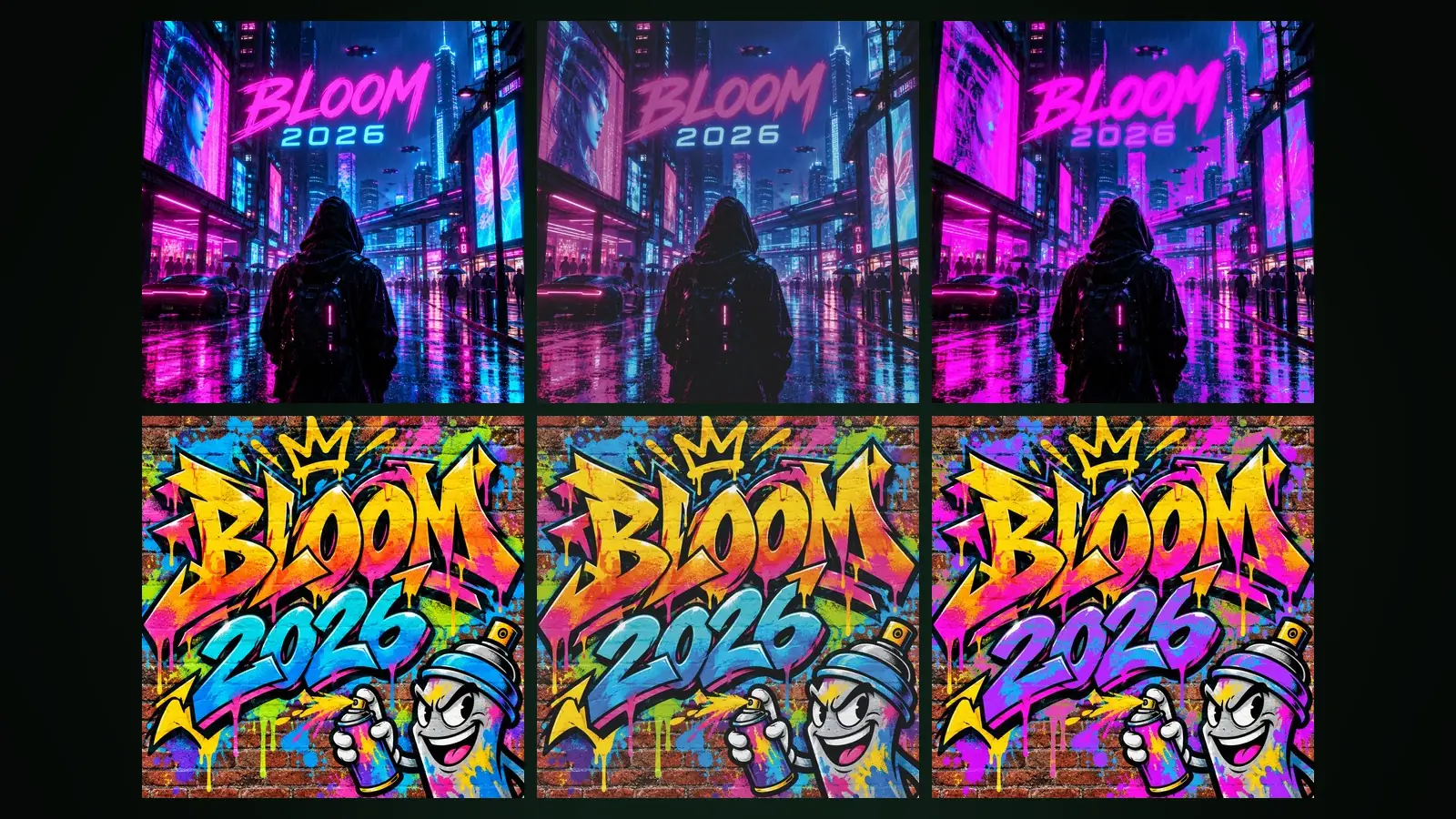
RGB is the colour model that creates colour by adding red, green and blue light; screens, phones and cameras work with it. CMYK creates colour by printing cyan, magenta, yellow and black ink onto white paper, absorbing part of the light. This is the main reason colours change in print: the range of colours CMYK can print (its colour gamut) is narrower than what an RGB screen can show, so the most saturated screen colours come out duller on paper.
This article explains how the two models work, what colour gamut, ICC profiles and rendering intents are, how to check a conversion and which mistakes are most common. In the last section you will find how to do the same job in Design Studio at Yeşilçam Studios.
How do RGB and CMYK work?
RGB is an additive model. On a black screen, with all three lights off, you see black; with all three at full strength, you see white. Each channel usually takes a value from 0 to 255, and the colour is the mix of those three values.
CMYK is a subtractive model. White paper reflects all the light; each layer of ink absorbs part of it. In theory cyan, magenta and yellow together should make black, but with real inks the result is a dark, muddy brown. That is why black (K) is added as a fourth ink; it deepens the dark tones and prints text sharply.
What is colour gamut, and which colours change most?
A colour gamut is the full set of colours a device or printing condition can produce. A typical screen's sRGB gamut is wider in many regions than the gamut of offset printing on coated paper. A colour outside the gamut cannot be printed; it is replaced by the nearest printable colour.
- Bright electric blues and purples. Blues and purples that glow on screen fade noticeably in print.
- Neon greens. Saturated, luminous greens turn into a darker, flatter green on paper.
- Vivid oranges and bright reds. Saturation loss shows here too, especially on uncoated paper.
- Very dark, detailed shadows. Because of the ink limit, the darkest tones move closer together and detail in the shadows can be lost.
The paper has a direct effect on the result. Coated paper holds ink on the surface and gives a wider gamut; uncoated paper absorbs ink, so colours come out softer and dark tones lighter.
What is an ICC profile, and how is the conversion done?
An ICC profile is a file, in the format defined by the International Color Consortium, that links the colours of a device or printing condition to a measured reference space. Converting from RGB to CMYK happens between a source profile (usually sRGB) and a destination profile. The destination profile is the answer to the question "which paper, which print standard":
- ISO Coated v2 (FOGRA39). For years the most common reference for offset printing on coated paper. Most printers in Europe and Turkey recognise it.
- PSO Coated v3 (FOGRA51). A newer profile characterised for the current print standard, taking into account coated papers that contain optical brighteners.
During conversion, the rendering intent decides how out-of-gamut colours are handled. The perceptual intent compresses all colours proportionally; the relationship between colours is kept, but in-gamut colours shift slightly too. The relative colorimetric intent leaves in-gamut colours untouched and only clips out-of-gamut colours to the nearest printable colour. Perceptual is often chosen for photo-heavy work, relative colorimetric for work with logos and brand colours.
When should you use pure black, rich black and spot colours?
In CMYK, black is not a single value. The same screen black can be prepared in three different ways for print, and each has its own right place.
- Pure black (K only). Printed with black ink alone. It is the right choice for body text, thin lines, small icons and tables; even with slight misregistration, letter edges stay clean.
- Rich black. A mix with some cyan, magenta and yellow added under the black. It gives a deeper, more saturated black on large dark backgrounds and big headlines. Ask your printer for the mix; every printer has a preferred value, and it must stay below the total ink limit.
- Spot colour. A colour printed with a premixed special ink instead of being built from the four process colours. It is used when a brand colour must come out the same on every print run, or to print a colour outside the CMYK gamut (metallic, fluorescent). It needs its own printing plate, so it adds cost.
The colour of the paper is part of the result too. There is no white ink in CMYK; white is simply the unprinted paper. On cream or recycled paper, white areas and light tones take on the colour of the paper, so the choice of profile should be made together with the choice of paper.
How do you check colours for print step by step?
- Ask your printer about the paper and the profile they expect. If you do not know, FOGRA39 is a safe start for coated paper.
- If you have brand colours, take their CMYK values from your brand guidelines; do not convert the RGB value by guesswork.
- Convert the design to the destination profile and inspect the paper appearance on screen with a soft proof.
- Identify the areas that lose colour. If the loss is somewhere important (a logo, a product colour), reselect that colour so it stays inside the gamut.
- Use rich black on dark backgrounds and black only for small text.
- For critical jobs, ask the printer for a calibrated hard proof (a sample print on paper); a screen preview cannot match paper exactly.
What are the most common mistakes?
- Trusting the colour on screen. A design prepared on a bright, uncalibrated screen prints darker and duller than expected.
- Setting small text in four-colour black. When four inks land on top of each other, the slightest shift leaves coloured fringes at letter edges. Small black text should be on the K channel only.
- Printing large dark areas in black only. 100 percent black on its own looks grey and flat over a large area. For large dark backgrounds, use a rich black mix recommended by your printer, and take care not to exceed the total ink limit.
- Exceeding the ink limit. If the four colours add up to more than the coated paper profile allows, the ink does not dry and sheets can stick together.
- Converting twice. Converting an image that is already CMYK again with another profile degrades the colours a little more each time.
Text legibility in print also depends on colour: a contrast that looks sufficient on screen can fall below the threshold once colours get duller. We cover this separately in the article on legible text over images.
How does CMYK conversion work at Yeşilçam Studios?
In Design Studio, designs are edited in RGB and the conversion happens at export. For print canvases the "CMYK (print shop)" option is ticked by default; it is available for the PDF and JPG formats. You choose ISO Coated v2 (FOGRA39) or PSO Coated v3 (FOGRA51) as the colour profile.
"Print preview" in the export dialog prepares a soft proof with the profile you chose. You get two images: how the design will look in print, and a map where areas that lose colour are marked in magenta. The dialog also states what percentage of the design will look duller in print; if the loss is not noticeable, it says "The colours print without noticeable loss". If the loss is in an important area, you can change that colour in the editor and run the preview again.
CMYK output and the print preview are available on Basic and Pro subscriptions; a CMYK or vector export has a list price of 1,021 tokens (Basic, about $0.01). These prices apply as of October 2026, and current prices are on the pricing page. For choosing a PDF/X standard and bleed, see the print-ready PDF/X article; for a screen-by-screen walkthrough, see the print export guide.
Frequently asked
Should I start my design in CMYK? It is not necessary. Designing in RGB and converting to the right profile at export makes it easier to use the same design both digitally and in print. What matters is checking with a print preview after conversion.
Why does the blue on my screen print dull? Bright screen blues are outside the CMYK colour gamut. They are replaced by the nearest printable colour, which is less saturated.
Does a soft proof replace a hard proof? Not entirely. A screen emits light and paper reflects it; the preview lets you see colour loss in advance, but for critical jobs the printer's proof on paper has the final word.
Can I use a CMYK file for digital sharing? It is not recommended. Social media and the web expect RGB; a CMYK file looks needlessly dull and sometimes wrong on screen. For digital use, download an RGB PNG, JPG or WEBP.
Can I download a JPG as CMYK? Yes. In Design Studio the CMYK option works for JPG as well as PDF; it is available on Basic and Pro subscriptions.