
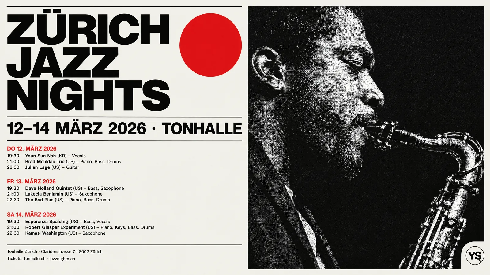
Text over an image is legible when the brightness difference between the colour of its letters and the background right behind them is large enough. That difference is measured with the contrast ratio. The web accessibility guidelines, WCAG, recommend at least 4.5:1 for normal text and at least 3:1 for large text. The hard part over an image is that the background is not a single colour, so the ratio has to be judged against the most difficult area under the text.
This article explains how the contrast ratio is calculated, what the thresholds mean, how to measure on a varied background, which techniques improve legibility and which mistakes are common. In the last section you will find how Design Studio at Yeşilçam Studios applies the same measure.
What is the contrast ratio and how is it calculated?
The WCAG contrast ratio is based on the relative luminance of two colours. Relative luminance expresses how bright the red, green and blue components of a colour appear to the eye, from 0 (black) to 1 (white). Because the eye is most sensitive to green and least sensitive to blue, the components are not weighted equally: green gets about 72 percent, red 21 percent and blue 7 percent.
The ratio is calculated like this: add 0.05 to the luminance of the lighter colour, add 0.05 to the luminance of the darker colour, and divide the first by the second. The result ranges from 1:1 (the same colour) to 21:1 (white on black). Hue alone does not create contrast; red and green of the same luminance may look vivid side by side but are hard to read as text.
What do the 4.5:1 and 3:1 thresholds mean?
| Case | Minimum ratio (AA) | Stricter level (AAA) |
|---|---|---|
| Normal text | 4.5:1 | 7:1 |
| Large text (about 18 point and above, or 14 point bold) | 3:1 | 4.5:1 |
| User interface components and meaningful graphics | 3:1 | Not defined |
The thresholds were written for the web, but their logic holds for print and social media visuals too. Large text reads at a lower ratio because the letterforms are wide. Small body text, dates, addresses and footnotes need a higher ratio. Posters are seen from a distance and social visuals on a small phone screen, often in sunlight, so staying above the thresholds makes a real difference in real conditions.
How do you measure contrast on a varied background?
On a flat colour background the measurement is a single number. On a photo or illustration, light and dark areas sit together under the text. Looking at the average colour is misleading: if 80 percent of a headline sits on a dark sky and 20 percent over a bright cloud, the average looks fine but the letters over the cloud disappear.
- Identify the area the text covers and the immediate surroundings of the letters; that is the background that affects reading.
- For each background pixel in that area, calculate the contrast ratio against the text colour.
- Look at the weakest portion, not the average. A practical method is to take the boundary of the lowest 10 percent of ratios.
- Compare that value with the threshold for the type of text: 3:1 for headlines and large text, 4.5:1 for other text.
- If it falls short, apply one of the techniques below and measure again.
Why do reading conditions differ on posters, screens and social media?
The same ratio gives different results under different reading conditions. Measuring contrast is a starting point; you also have to account for where and how the design will be seen.
- Posters and roll-ups. Seen from a distance, often while walking past. The headline must be read in a few seconds, so a large size, a heavy weight and a calm background matter as much as the ratio itself.
- Phone screens. Social visuals appear as a small square in a feed, often with the brightness turned down or the screen in sunlight. A subheading that reads fine full screen can disappear in the small preview in the feed.
- Printed material. Paper does not emit light; it reflects the light around it. On matte paper dark tones lift a little and colours dull; a ratio that just passes on screen can fall short in print.
A practical habit: check the design at its final size and in its final conditions. Look at a social visual shrunk down on a phone, a poster scaled down on screen as if seen from a distance, and a print job with the print preview.
Which techniques improve legibility?
- Colour choice. The first thing to try is changing the text colour: a very light or very dark version of the same hue, another colour from your palette, white, or a near-black. This is the route that changes the character of the design least.
- Moving to a calm area. A flat, low-detail part of the image (sky, wall, floor) is a natural place for text. Leaving that space free when the composition is built gives the cleanest result.
- Band or background box. Putting a solid or semi-transparent band behind the text makes the ratio independent of the background. It looks natural in flat graphic styles such as Swiss design.
- Outline (stroke). A thin outline in a contrasting colour around the letters separates the text from a busy background. In styles like pop art and comics it is part of the aesthetic.
- Shadow and scrim. A soft shadow, or a gradient that darkens the image towards the text area (a scrim), increases contrast. Because it involves transparency in print, it can affect your choice of PDF standard.
- Typeface and size. A heavier weight and a larger size read better at the same ratio. Thin typefaces are the first to disappear over images.
What are the most common mistakes?
- Deciding by the average colour. The brightest or darkest part of the background makes part of the text invisible.
- Letting text run over the product or the logo. Neither the product nor the text can be read. Text, product and logo should sit in separate areas.
- Forgetting colour loss in print. A ratio that just passes on screen can fall below the threshold once colours dull in CMYK; details in the CMYK and RGB article.
- Relying on hue alone. Green on red or purple on blue, at similar luminance, is unreadable for readers with colour vision deficiency.
- Applying the same fix to every text. A shadow that is enough for a large headline will not rescue a small address line.
How is legibility measured and fixed at Yeşilçam Studios?
Design Studio does not paint texts into the image; every text is a separate, editable layer. That makes it possible to measure the real background under the text. The measure is the same as described in this article: it takes the lowest 10 percent of contrast ratios of the pixels under the text and a ring around its letters. The threshold is 3:1 for headlines and text that is large relative to the canvas height, and 4.5:1 for other text.
When Sam prepares a design, texts are checked against the real background with this measure; text that falls short is moved, recoloured, or given an outline or a band that suits the style. Text running over a product or a logo is checked as well. When you select a text layer in the editor, the "Legibility" indicator shows the measured ratio: "Reads well" if it is enough, otherwise "Low contrast" with the minimum ratio needed. In that case the "Make legible" button appears; it first looks for the colour closest to the current one that passes the threshold (a lighter or darker version of the same hue, colours from the design and brand palettes, white, a near-black); if none is enough, it adds a contrasting outline to the text. You can also set the outline yourself with the "Text outline" and "Outline width" fields.
When you export, the dialog warns you, with a count, if any text layer does not stand out enough from the background; the warning does not block the download. The legibility indicator and "Make legible" in the editor cost no extra tokens. For a screen-by-screen walkthrough, see the editor and legibility guide; for your first design, see the getting started with Design Studio guide.
Frequently asked
Isn't WCAG only for the web? The guidelines were written for web content, but the contrast ratio is a general method for measuring the luminance difference between colours. It is a good reference for posters, menus and social visuals with the same logic.
Is 3:1 enough for a headline? For large and bold headlines, 3:1 is WCAG's minimum level. For a poster read from a distance or a screen viewed in sunlight, a higher ratio is safer.
Why measure the lowest 10 percent rather than the average? Readers stumble on the weakest part of the text. The average hides letters lost over a bright cloud or a dark shadow; the lowest slice catches that risk.
Will "Make legible" spoil the design's colours? It first picks the colour closest to the current one that passes the threshold, so the change is as small as possible. If you do not like the result, undo it and adjust the colour or the outline by hand.
Does an outline cause problems in print? No. The outline is drawn as vector together with the text and stays sharp in PDF/X-4, SVG and EPS output.