
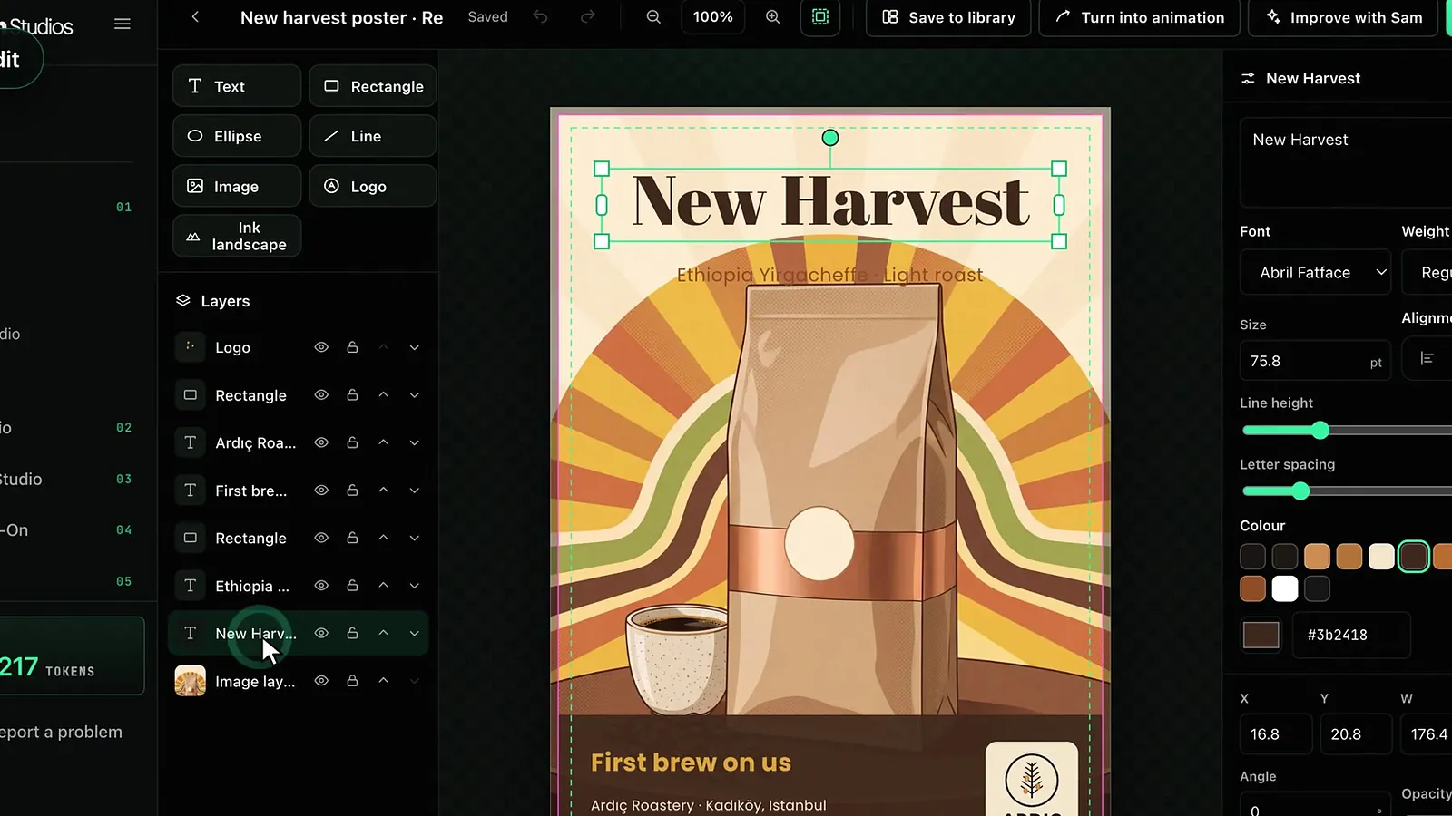
The Design Studio editor lets you change every text, image, logo and shape in the design Sam prepared as a separate layer. When you select a text, the legibility indicator measures how well it stands out from the background; if the contrast is low, the Make legible button fixes it in one click.
This guide covers the editor’s tools, text settings, the bleed and safe area lines, legibility measurement, the Ink landscape layer and how saving works, as of October 2026.
What is in the editor?
- Tools. Add Text, Image, Logo, Shape (rectangle, ellipse, line) and Ink landscape.
- Layers. Show or hide, lock, bring forward or send backward any layer.
- Properties panel. Position, width and height, angle, opacity and alignment of the selected layer; Duplicate and Remove are here too.
- Design panel. With no layer selected, you manage the background colour and the colour palette (Style, Brand, Yours).
- Top bar. Undo, Redo, zoom, Fit and the Bleed and safe area button.
On a phone the editor is simplified: the bottom bar holds Undo, Text, Edit text and Library. A computer screen is more comfortable for detailed work. For an overview and samples, see the Design Studio page.
Working with text
When you select a text layer you can edit the words and change the font, weight (Light, Regular, Bold, Black, depending on the font), size, alignment, line height, letter spacing and colour. The editor offers 13 open-licence font families in sans, display, serif, handwritten and monospace groups. The Text outline and Outline width settings add a thin line around the text, which helps legibility over busy backgrounds.
The alignment buttons align the selected layer left, right, top or bottom, or centre it horizontally and vertically. Duplicate makes a copy with the same settings, handy for the second text on a bilingual poster. Shape layers have fill colour, outline colour and width, and corner radius. Putting a semi-transparent rectangle behind text is the classic way to keep it legible over a busy background.
Bleed and safe area
On print canvases the Bleed and safe area button shows two lines. The pink line is the trim line; the 3 mm bleed outside it is cut off after printing. The inside of the green dashed line is the safe area: keep text and logos inside it so nothing is lost when trimming. Background images and colour areas, on the other hand, should extend to the bleed.
How do you read the legibility indicator?
When a text layer is selected, a Legibility line appears in the panel. The measurement looks at the background actually visible under the text (all layers except the text, as drawn) and calculates the contrast ratio between the text colour and that background. To catch the worst case, the weakest areas around the letters are what count.
- Headlines and large text. At least 3:1 contrast is expected.
- Other text. At least 4.5:1 contrast is expected.
- Overlap. A separate warning appears if the text runs over a product or a logo.
The indicator says Reads well or Low contrast; it shows the measured ratio and, when needed, the minimum ratio expected. If the background image has not loaded yet, the measurement waits. For the topic in depth, see legible text on images.
What does Make legible do?
When contrast is low, a Make legible button appears under the indicator. It tries lighter and darker shades of the current text colour, the colours in the design palette, white and black; among those that pass the threshold it picks the one closest to the current colour, so the design’s colour scheme is kept. If no suitable colour is found, it adds an outline in a contrasting colour. If you do not like the result, Undo takes you back. The export window also counts hard-to-read text layers and warns you, but it does not block the download.
The Ink landscape layer
Ink landscape in the tools adds a landscape of mountains, water, mist and small buildings in the Chinese ink painting tradition to your design as a layer. The layer sits above the image and covers the canvas including the bleed. It is free and it is true vector artwork: exported as real paths to SVG, EPS and PDF/X, with clean CMYK conversion.
- Palette. Ink, Sepia, Blue-green, Night and Yeşilçam.
- Season and density. Spring, Summer, Autumn, Winter; Sparse, Medium, Dense.
- Elements and sky. Water, Buildings, Figures, Mist and Seal can be switched on and off; the sky can show a Sun, a Moon or neither.
- Another landscape and Travel the landscape. Draw a new landscape, or slide sideways through the same one to pick another section.
The moving version of the same engine is the Ink Landscape style in Animation Studio; see the Ink Landscape guide.
Improve with Sam, saving and sharing
Improve with Sam in the top bar reworks the design from an instruction, e.g. “Make the headline bigger, move the logo to the top left, turn the bottom band dark navy.” Sam keeps the layers you want; if you tick Also regenerate the image layer, a new background image is generated too and its cost is added. Changes are saved automatically; the screen shows Saving, Saved or Unsaved. Save to library adds the design to your library as an image; Turn into animation sends the same image to the Custom section of Animation Studio, see the Custom guide. For print preparation, continue with the export guide.
Frequently asked
Where do the legibility thresholds come from? They follow the contrast thresholds widely used in web accessibility guidelines: 3:1 for large text and headlines, 4.5:1 for other text.
Will Make legible spoil my design’s colours? It picks the colour closest to the current one among those that pass the threshold; if none fits, it adds an outline. Every change can be undone with Undo.
Does the Ink landscape layer cost anything? No, it is free; the plan rules are the same as for other layers.
What happens if I open the same design in two tabs? If the design changed elsewhere, the editor loads the latest version and tells you.
Can I upload my own font? As of October 2026 the editor offers only the 13 open-licence font families in its own catalogue.