
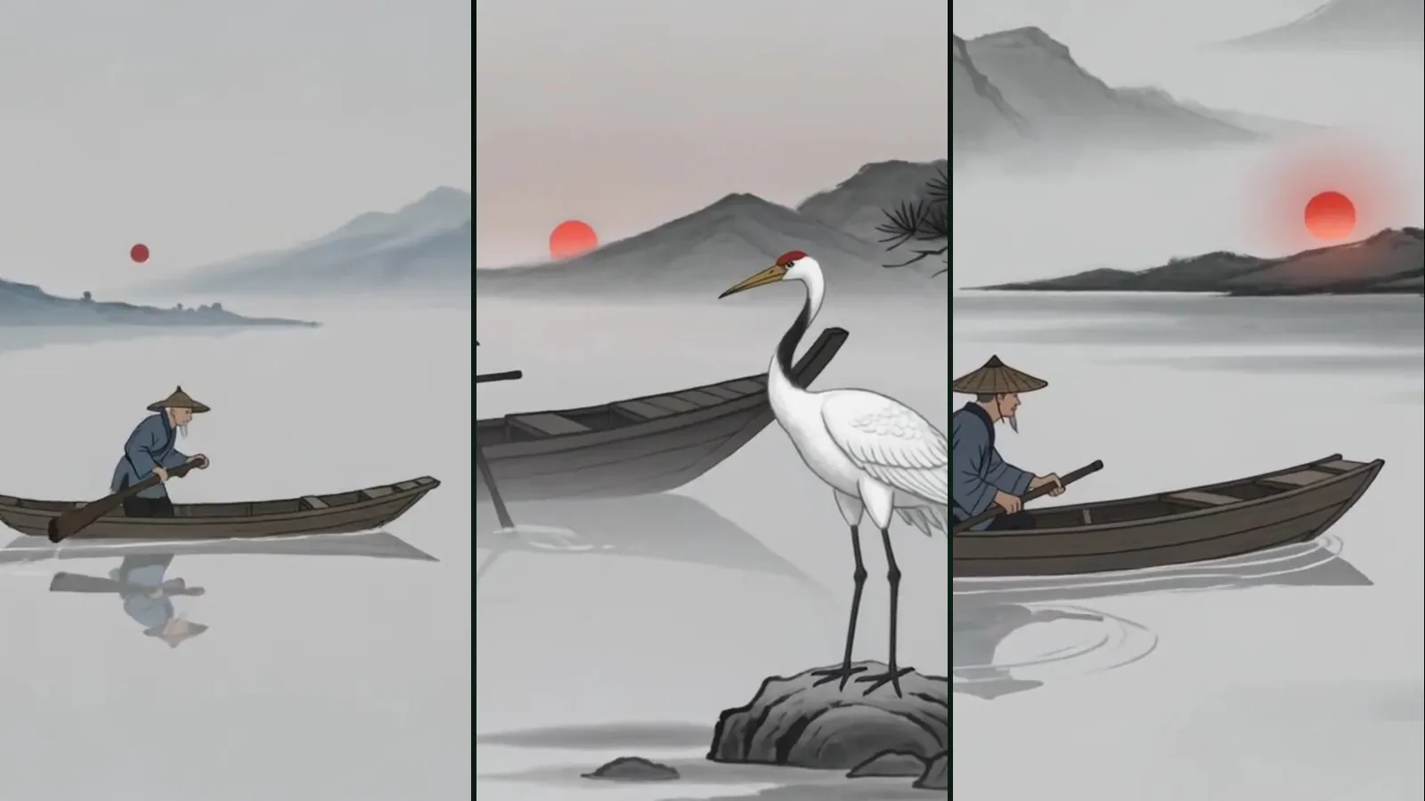
Ink landscape transitions add short, gliding shan shui landscapes to a story film: one at the opening, one at the end, and up to two between chapters. They suit Eastern stories, fables, legends and poetic journeys. The option is in the Story to film form, has three settings (Off, If the director suggests, On) and is free.
Where is the option?
Open Film Studio › Flow Studio and choose the "Story to film" card; the full flow is in the story to film guide. In the form, below the style and music choices, you find "Ink landscape transitions" with three buttons.
What do the three settings mean?
| Setting | What happens |
|---|---|
| If the director suggests | The director adds transitions only if the story fits: East Asian themes, fables, legends and epics, poetic journeys, or stories about nature and seasons. Other stories get none. |
| On | Transitions are added to the film whatever the story; the director picks the palette and the chapter breaks. |
| Off | No transitions; the film cuts from scene to scene as usual. |
The form starts on "If the director suggests". Switch it to Off for stories where an ink landscape would feel out of place, such as a modern office comedy, and to On when you want the look regardless.
Where do the transitions appear?
- Opening: a landscape that fades in from black before the first scene.
- Chapters: at most two breaks, placed where a new chapter of the story naturally begins.
- Ending: a closing landscape after the last scene.
Each transition is a short, silent clip of about five seconds in the film's aspect ratio (16:9, 9:16 or 1:1), so the landscapes frame the story without speaking over it.
Which palettes are used?
The director chooses one palette per film, based on the story:
- Ink: black and grey ink on paper, the default.
- Sepia: warm, old-time tones for stories set in the past.
- Blue-green: the classical blue and green landscape colours, for vivid nature and fairy tales.
- Night: dark tones for stories that take place at night.
You do not pick the palette yourself; it follows the mood the director reads in your story. If you want a particular one, say so in the story's tone or setting, for example by making clear it is a night journey.
Which visual styles do they go with?
The transitions work with every visual style, but they sit most naturally next to Ink wash, Watercolor and Anime. With Cinematic realism they act as a stylised chapter card. Style choice is covered in choosing a visual style.
What does it cost?
Nothing. Ink landscape transitions are free in every plan and do not appear in the quote. The cost of the film is the same with or without them.
What if something goes wrong?
If the transitions cannot be added for any reason, the film is assembled without them, exactly as it would have been with the option off. A problem with a transition never stops the film from being finished.
How does this relate to Ink Landscape in Animation?
The transitions use the same landscape engine as the Ink Landscape style in Animation Studio, where a whole film can travel through an endless ink landscape with its own palette, season and effects. Read the Ink Landscape guide for that. The tradition behind both is covered in sumi-e and shan shui.
What does it look like in a typical film?
Take a fable of three chapters with the setting on "If the director suggests". The director reads a mountain journey, decides the transitions fit and picks the ink palette. The finished film opens with a landscape fading in from black, the first chapter plays, a landscape glides by before the second chapter and again before the third, and a last landscape closes the film after the final scene. The same story written as a modern city drama, with the same setting, would get no transitions at all.
When should you leave them off?
- Product, explainer or advertising stories where every second should show the subject.
- Very short films, where an opening and an ending would take a large share of the running time.
- Stories with a strongly modern or urban look that the landscape would contradict.
Tips for a good result
- Write the story in clear chapters; the director places the breaks at natural chapter starts.
- For a short film of one minute or less, an opening and an ending are often enough; chapter breaks matter more in longer stories.
- If the story is not Eastern or fable-like but you still want the look, choose On rather than relying on the director.
Frequently asked
Do ink landscape transitions cost tokens? No. They are free and the film costs the same with or without them.
Can I choose the palette? Not directly. The director picks ink, sepia, blue-green or night to match the story; the setting and tone you write steer the choice.
How many transitions does a film get? An opening, an ending and at most two chapter breaks.
Will the film fail if a transition fails? No. The film is then assembled without transitions, as if the option were off.
Do the transitions have sound? No. Each transition is a silent clip of about five seconds.
Do the transitions work in vertical and square films? Yes. The landscapes are prepared for 16:9, 9:16 and 1:1, and the film uses the version that matches its aspect ratio, so a vertical story for social media gets vertical landscapes rather than a cropped wide shot.