
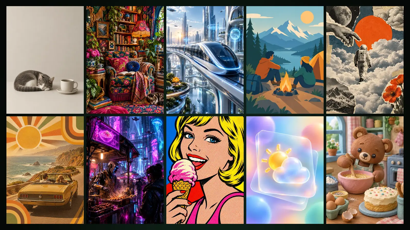
Yeşilçam Studios has 21 design styles: Minimalism, Maximalism, Futuristic, Vector Art, Collage Art, Retro, Cyberpunk, Pop Art, Glassmorphism, Clay Style, Pixel Art, Editorial, Y2K, Swiss Design, Surreal Design, Bohemian, Victorian Style, Graffiti, Aurora, Handwritten and Ink Wash Painting. Pick a style, write your subject, and the image is drawn by the rules of that design movement.
The same 21 styles appear both in Image Studio’s Design Styles category and in the Style step of Design Studio. This guide explains what each style looks like, what it suits, how the style templates work and what the Improve with Sam button does.
What is a design style and where do you use it?
A design style is a ready-made visual language that settles colour, shape, texture and layout decisions in one go. In Image Studio each style is a template: open the Templates tab at /app/image and choose the Design Styles category. For working with templates in general, see the Image Studio guide. In Design Studio the same list appears in the Style step of the new design form; there you also have a Free option, which lets Sam choose the style.
The 21 styles and what they are for
| Style | Look | Default ratio | Works well for |
|---|---|---|---|
| Minimalism | Plenty of space, few colours, one focus | 1:1 | Product launches, clean brand visuals |
| Maximalism | Pattern on pattern, bold colour, abundance | 3:4 | Festivals, fashion, eye-catching posters |
| Futuristic | Sleek surfaces, light lines, the near future | 16:9 | Tech, launches, events |
| Vector Art | Clean shapes, flat colours, crisp edges | 1:1 | Icons, stickers, work headed for vector export |
| Collage Art | Cut paper, vintage magazines, layers | 3:4 | Arts and culture, magazines, covers |
| Retro | Warm 1970s colours and nostalgia | 3:4 | Cafés, music, nostalgic campaigns |
| Cyberpunk | Neon lights, rain, a dark city | 16:9 | Games, night events, cover art |
| Pop Art | Bold outlines, primary colours, halftone dots | 1:1 | Social media, playful campaigns |
| Glassmorphism | Frosted glass layers, soft light | 1:1 | Apps, digital product promotion |
| Clay Style | Hand-sculpted, soft, cute 3D | 1:1 | Kids’ products, mascots, friendly explainers |
| Pixel Art | Square pixels like classic games | 16:9 | Games, retro digital work |
| Editorial | Magazine-grade art direction | 3:4 | Fashion, interviews, covers |
| Y2K | Chrome, sparkle, 2000s optimism | 1:1 | Young audiences, music, fashion |
| Swiss Design | Grid, asymmetry, pure geometry | 3:4 | Concerts, conferences, typographic posters |
| Surreal Design | Dreamlike, impossible, poetic | 16:9 | Album covers, artistic campaigns |
| Bohemian | Earthy tones, handmade textures, plants | 4:3 | Handmade goods, lifestyle |
| Victorian Style | Ornate, opulent, 19th century | 3:4 | Invitations, labels, classic brands |
| Graffiti | Spray paint, vivid colour, street energy | 16:9 | Street culture, sport, youth |
| Aurora | Colours that flow like the northern lights | 16:9 | Backgrounds, announcements, digital banners |
| Handwritten | Ink, pencil and hand lettering | 3:4 | Menus, notes, personal messages |
| Ink Wash Painting | Rice paper, brush strokes, misty empty space | 3:4 | Poetic posters, culture, tea and food |
The Look column repeats the style hints in the app. The default ratio is the one preselected when the template opens; in Image Studio you can switch between 1:1, 16:9, 9:16, 3:4 and 4:3.
How do you create an image with a style template?
- In Image Studio, open the Templates tab and choose the Design Styles category.
- Click a style card. The card shows a sample image and a short hint.
- Write what you want drawn in the Subject field. This field is required; Details is optional.
- Swiss Design also has a Title field, and Handwritten has a Words to letter field. That text is rendered in the image exactly as you write it.
- Press Improve with Sam if you like, then choose the ratio and quality and press Generate.
The Details field is for adding a note on colour, season, light or composition without changing the subject: “evening light, warm tones, empty space on the right”. Style templates open in Standard quality; switch to Draft while you explore and to Standard or Cinema for the final version. Generating the same subject in a few styles and comparing them side by side is the quickest way to find the right visual language for a campaign.
How does Improve with Sam work?
The Improve with Sam button under the Subject field turns a short idea into a detailed description in the language of that style. A line like “a cat sleeping next to a morning coffee” grows into a description with light, composition and texture details. If the Subject field is empty, the button becomes Write with Sam and suggests an original subject that suits the chosen style.
The estimated cost is shown next to the button; only actual usage is charged, and when it finishes the “Written by Sam” note shows the amount spent. If Sam cannot answer, the tokens are refunded. If you do not like the suggestion, Undo restores your earlier text. Whatever you write in the Avoid field is also taken into account in the description Sam writes.
Why does Ink Wash Painting have a place of its own?
Ink Wash Painting follows the language of traditional East Asian ink painting (sumi-e): textured rice paper, dry brush strokes and misty empty space. The main subject is painted in detail in the foreground, while the background usually stays empty and calm. The sample subject in the app is “an old fisherman in a straw hat rowing a boat on a misty lake”. The moving version of the same look is the Sumimation style in Animation Studio; see the Sumimation guide.
What should you consider when choosing a style?
- Amount of text. If your poster carries a lot of text, orderly styles such as Swiss Design, Minimalism or Editorial leave room for it.
- Vector output. If you will export SVG or EPS from Design Studio, flat-colour styles give cleaner results. Glassmorphism, Aurora, Y2K, Editorial and Ink Wash Painting show a vector warning; details in the vector guide.
- Print. No style prevents printing, but very bright neon colours (Cyberpunk, Y2K) can look duller in CMYK print.
- Consistency. Using the same style across every piece of a campaign gives you a consistent series under one project in Design Studio. See Getting started with Design Studio.
Frequently asked
Do design style templates cost extra? No. Like any other template, style templates are charged at the price of the quality you choose; if you use Improve with Sam, its small cost is added. Current prices are on the pricing page.
Are the styles in Image Studio and Design Studio the same? Yes. Both studios use the same 21 styles under the same names; an image made in one style can become a design in the same style in Design Studio.
Can I describe my own style? On Image Studio’s Create tab you can describe any style in your own words. In Design Studio the Free option leaves the style to Sam.
Is there a style that puts text in the image? Swiss Design has a Title field and Handwritten has a Words to letter field. In the other styles you can add text in quotes in the Details field.
How much does Improve with Sam cost? The estimated cost is shown next to the button; only actual usage is charged and nothing more is taken.