
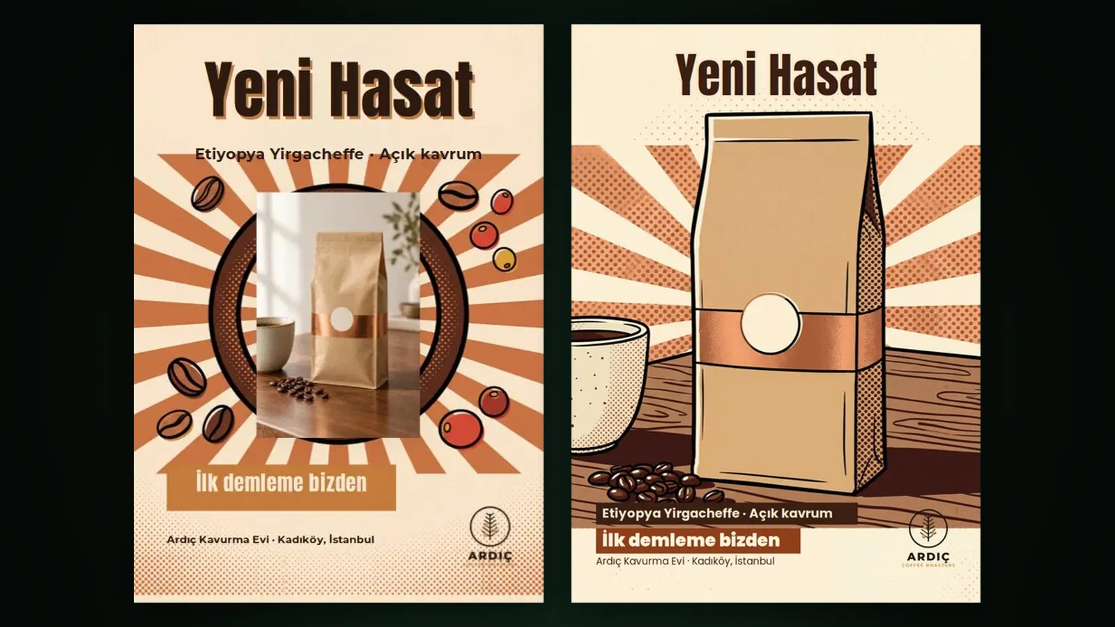
When you add a product photo in Design Studio, you can use it in three ways: integrate it into the scene (the default), remove its background and place it as it is, or set it in as a framed photo. With integration, Sam redraws the product inside the scene in the design’s style and checks the result against your product; the legibility of your text is measured separately as well.
This post explains how we tackled the “pasted-on product” problem. The details of each option are in the images, products and logos guide.
What was the problem?
Putting a product photo on top of a ready-made background is easy, but the result usually shows: the light comes from another direction, there is no shadow, and the product floats in front of the scene. On the other hand, having the product redrawn from scratch is risky; the label, logo or colour can change. We wanted to solve both problems together.
Three options
- Integrate into the scene: Sam redraws the product inside the scene in this style; its shape, colour, label and logo are kept. The result also goes through a fidelity check; if the product looks pasted on or details differ, one corrective redraw is made.
- Remove background, use as is: Your own product photo is placed with its background removed and a soft shadow that matches the scene light. Every pixel of the packaging is your shot.
- Use as a photo (framed): The photo is placed as it is, as a framed picture. It suits photos of a venue, a team or customers.
How is legibility checked?
When a product enters the scene, the ground under your text changes. Before delivering the design, Sam measures the real background under each text and checks whether the text runs over a product or logo; if needed, it moves the text, changes its colour or adds an outline or a band. In the editor, the “Legibility” indicator shows the contrast ratio for every text layer: at least 3:1 for headlines and at least 4.5:1 for body text. If the ratio is low, the “Make legible” button fixes it in one click; you can also adjust it by hand with “Text outline”. If a hard-to-read layer remains when you export, you get a warning. The background to these rules is in the readable text on images article.
Tips
- A sharp photo of the whole product on a plain background gives the best result with all three options.
- If the packaging text must stay exactly as it is, use “Remove background”.
- Add a short instruction next to the image, such as “Product centred, with shadow”; it steers the layout directly.
- If you enlarge or move text later, check the legibility indicator again.
How much does it cost?
With integration you see two extra lines in the quote: “Product fidelity check (estimate)” and “Possible redraw share (refunded if unused)”. If no redraw is needed, that share returns to your balance. At the Basic list price the image layer is 11,376 tokens ($0.07) on draft, 44,042 ($0.26) on Print 4K and 71,167 ($0.43) on Premium 4K; the Free plan applies ×1.3 and Pro ×0.8. Current prices are on the pricing page. You will find the whole studio in our Design Studio launch post and on the Design Studio page.
Frequently asked
Which option is the default? “Integrate into the scene” is the default. You can switch to either of the other two when you add the product.
Is the redraw share always charged? No. It is used only if the check calls for a correction; otherwise it is refunded.
Can I have my logo integrated into the scene too? A logo is added with its own role and stays a layer. You set its position with an instruction or in the editor.
Does Make legible change my text? No, it leaves your wording untouched. It only adjusts position, colour or outline so the text stands out from the background.